The 7-Second Test: How to Make Your Homepage Actually Convert
- March 3, 2021
- Uncategorized
You had your game plan.
You were going to put together a homepage that turned visitors into customers. Those customers were going to become raving fans of your business. They would tell all of their friends, family, and colleagues about you. You would tell your grandkids about your business success and ride off into the sunset on a horse named ROAS.
It was beautiful, except… it never was.
Your homepage might still be in the construction zone or could be live, but it’s not getting you the results you’d hoped for. You know there’s a little (read: A LOT) wrong with it. You see the pageviews come in—where are the conversions?
Traffic and conversion master, and CEO of DigitalMarketer, Ryan Deiss knows.
In his DM Lab workshop on Crafting a High-Converting Homepage, Ryan breaks down exactly what a homepage needs to do to get conversions. Turns out you don’t need GIFs or a 5-figure per month graphic designer on retainer.
You just need to pass the 7-Second Test.
The 7-Second Test
Yep, this test takes 7 seconds to complete.
There’s one goal with this test: to see what people think your business does. Even if those people aren’t your customer avatar, they’re going to give you the intel you need to create a high-converting homepage.
Here’s how you’re going to run your own 7-second test to see how you can improve your homepage.
Step #1: Find volunteers (friends, family members, anybody with opposable thumbs) who will help you audit your homepage
You don’t need the people who audit your homepage to be your customer avatar. If you know customer avatars who can help you, then that’s ideal. BUT, it’s not at all a necessity to create a successful 7-second test. Ask 5+ people if they can take a quick look at your homepage so you can figure out how to improve it.
Step #2: Tell them who your business serves
Next, you’re going to explain what hat the person auditing your homepage is going to wear. Since you only care about a certain customer avatar’s opinion of your homepage, you want this person to know who they’re channeling. The key here is to make sure that you’re not telling them what problem your business solves, just who it helps.
Step #3: Have them review your homepage for 7 seconds
The moment is here. Make sure to have some of your volunteers review your desktop homepage and others review your mobile homepage. Give them 7 seconds to review it, with only giving them the context of who it helps. Once the 7 seconds are up, ask them for feedback.
Step #4: Ask 3 feedback questions
With your homepage fresh on their mind, ask your volunteers these 3 questions:
- What do we do?
- What problem do we solve?
- What action do we want you to take?
Write down their responses. It’s wishful thinking to imagine that you’ll remember everything they say, and this feedback is far too close to gold to forget. You want every adjective used, confusion point, and even the most painful feedback so that you can improve.
Step #5: Brainstorm key insights and action items
Time to put your feedback to work. Look through the responses to your 3 questions and see what patterns you find. Did your respondents easily figure out what you do, but nobody knew what action they should take? Or, did some of your respondents figure out what problem you solve, and others didn’t?
Figuring out where you’re going wrong on your homepage will help you avoid looking like Rachel’s Thanksgiving Trifle (unless your customer avatar is Joey, in which case your homepage looks “Goooood”).
3 Critical Questions Every Homepage Must Answer in 7 Seconds (Or Less)
In 2011, Nielsen Norman Group figured out that “users often leave Web pages in 10–20 seconds, but pages with a clear value proposition can hold people’s attention for much longer.”
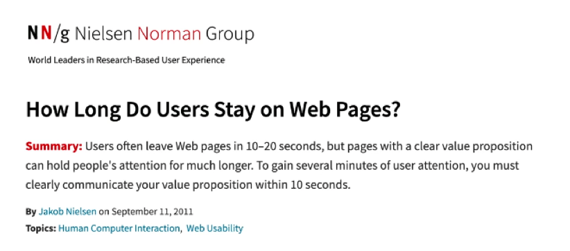
This data is almost a decade old, which tells us that 10 seconds is a luxury. People’s attention spans haven’t gotten longer—at best, you have 7-seconds to create your “clear value proposition.”
That’s why every homepage needs to answer 3 critical questions… fast.
- What is it?
- Why should I care?
- What now?
Here’s the thing about homepages. They’re hard to build. They’re not like landing pages or sales pages that have a clear goal. Your landing page asks someone for one action. Your sales page only gives people the option to buy.
Homepages don’t serve one purpose or even one person. Sometimes they’re serving a bunch of different people—and you have to figure out how to make them ALL happy.
To name a few, your homepage is serving:
- Existing customers
- A prospect referred by a customer
- A hot lead ready to buy, doing quick research
This is why homepages are so hard to build, and why you’ve been struggling to “get it just right.” As Ryan explains in his Workshop, when he made his first online sale in 1999—all you needed was a header and copy. Homepages didn’t even need a logo or branding to make the sale.
Today, it’s totally different. Google’s been studying what makes a good homepage for decades and they’ve narrowed it down to the Zero Moment of Truth.
The Role of a Homepage
The First Moment of Truth in retail is when the consumer sees your product on a store shelf. In the digital world, it happens when someone sees it on an ecommerce page or a sales page. The reason there’s a Zero Moment of Truth comes from people going backward from this point.
When a consumer is on your ecommerce page or sales page and purposely goes to your homepage—they just entered the Zero Moment of Truth. They’ve moved backward to do research on your company before they buy your product. After they’ve gone to your homepage, they’ll decide if it’s worth it to go back to your product or sales page.
As Ryan explains, “A great homepage won’t close the sale, but it absolutely can lose the sale.”
If people see something inconsistent on your homepage, they’re gone. That’s why having a high-converting page matters.
Based on the Zero Moment of Truth, your homepage has 3 roles:
- Clarify the benefit
- Establish trust
- Point the way
You’ll fulfill these roles by figuring out what kind of homepage you need. There are 3 kinds of homepages that we’ll talk about in the next section and each is designed for specific purposes.
3 Types of Homepages
Just like with clothing, there is no one-size-fits-all templates for homepages that actually fits every business. Those one-size-fits-all templates are going to fit some of you. Let’s make sure you’re creating the homepage that fits your business by narrowing it down to 3 categories.
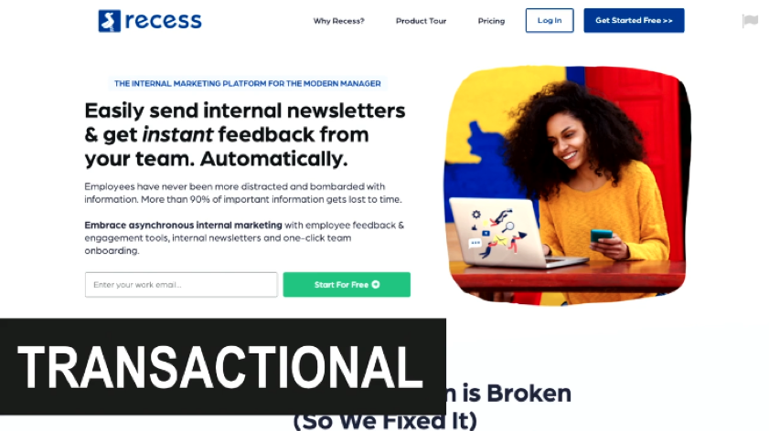
#1: Transactional Homepages
In a transactional homepage, there’s a call to action designed to elicit action. As the name implies, you’re looking for a transaction to be made (even if that’s just signing up for a free trial). Your homepage is most likely a transactional homepage, but we’ll show you the other options just in case.
An example of a transactional homepage is the Recess.io homepage:
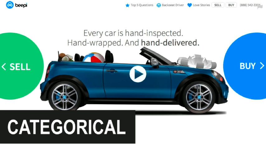
#2: Categorical Homepages
Categorical homepages identify users based on which of your customer avatars they are. These homepages are ideal for marketplaces and businesses that serve different avatars. On a categorical homepage, you’re asking the user to tell you which of your customer avatars they are. For example, Uber serves riders and drivers with the same platform.
Here’s an example of a categorical homepage from Beepi, a platform for selling and buying a car:
#3: Consumption Homepages
The goal of a consumption homepage is to maximize on-page time and readership. Generally, you can think of media companies having consumption homepages. On these homepages, there aren’t any calls to action and they’re not considered high-converting anymore. Remember back in the day when having your blog be your homepage was all the rage? Yeah… don’t do that anymore.
Here’s an example of a consumption homepage from The Wall Street Journal:

For the most part, you can focus on transactional homepages. Even if you serve two different customer avatars, your Categorical Homepage is going to act as a homepage to 2 Transactional Homepages (one for each of your customer avatars).
Quick recap here. So far, you’ve learned:
- How to run a 7-second test
- The 3 critical questions your homepage needs to answer (in 7 seconds)
- The role of your homepage
- The 3 types of homepages
Now it’s time to craft the core message of your homepage.
Crafting Your Homepage’s Core Message
Grab your meditation cushion, get some incense, play that Tibetan bowl playlist, and meditate on your business’s core message. Well, maybe you can use that time to focus on your life’s purpose instead. As Wayne Oates so gracefully shared, “Everything you need, you already have.” We had no idea he knew so much about homepages when he shared such enlightenment with the world.
It’s true. You actually already have everything you need to write a high-converting homepage—just like you have everything you need within you to reach your goals.
Thanks to your 7-second test feedback, you’ll know if you’ve missed the mark on your core message. Unless you passed the test with flying colors, chances are you need to take a quick run through your core messaging.
Your homepage’s core message just involves being clear on 3 things:
- Clarifying your audience
- Determining your audience’s awareness level
- Selecting your primary CTA
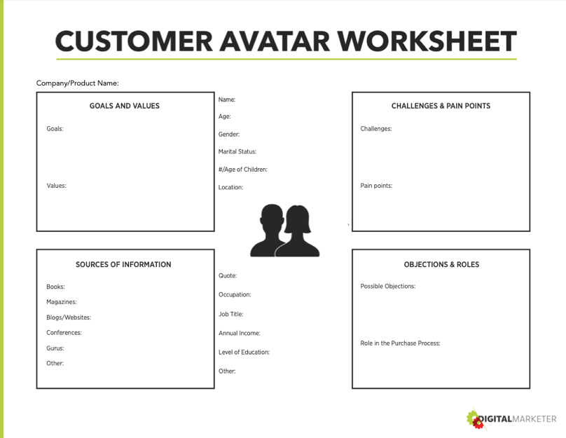
#1: Clarifying your audience
You can use the Customer Avatar Worksheet to get to know your customers better than you ever have before. From their goals and values to their challenges and pain points, this DigitalMarketer created worksheet (yes, we’re bragging) has helped thousands of business owners figure out who they’re selling to.
#2: Determining your audience’s awareness level
When someone visits your homepage, they either know they have a problem or they’re evaluating which solution is best for them (sorry to remind you about the competition).
Your audience is looking for hope and clarity, whether it’s the first time they’ve made contact with your website or it’s their Zero Moment of Truth. They’re looking you up and down and deciding if you’re the person they trust to help them solve their problem.
They want you to give them the hope that their problem can be solved and the clarity that shows you’re the people for the job.
#3: Selecting your primary CTA
There is no such thing as a Transactional Homepage without a call to action. Your call to action is the part of your homepage where you point visitors in the right direction. You’ve gone through the basics of showing them “What is it?” and “Why should I care?” and your CTA promotes “What now?”
Your call to action doesn’t have to lead directly to a sale. It could be for a lead magnet, a free trial, signing up for a free product, etc. Your call to action should be pretty obvious based on your business goals.
It’s time to say something that you cannot forget. Cannot, cannot, cannot. Your homepage needs to have one primary CTA. Choose the one amazing thing you want someone to do while visiting your website and avoid giving them a bunch of different options of actions to take.
Your homepage is set and ready to go live—right? Well, not quite.
Would we even be marketers if we didn’t tell you to test it again? Run your 7-second test again to see what the feedback is. This time around, you’re going to see *major* improvements from last time and you might even get that perfect feedback.
- If you do, go live and make business happen.
- If you don’t, go live and keep fixing your homepage as you go (build that airplane in the sky!).
And like the great marketer you are, keep testing that page. Test your copy, your images, your colors, your buttons…
High-converting homepages aren’t made overnight, but neither are your business dreams. It takes work and doesn’t that make it so much more satisfying in the end?
(We’re not actually sure on that, but since we haven’t found the steroids of the marketing world yet we’re still doing things the old-fashioned way).
Use the 7-second test to create the high-converting homepage you always knew you were capable of.
The post The 7-Second Test: How to Make Your Homepage Actually Convert appeared first on DigitalMarketer.
About us and this blog
We are a digital marketing company with a focus on helping our customers achieve great results across several key areas.
Request a free quote
We offer professional SEO services that help websites increase their organic search score drastically in order to compete for the highest rankings even when it comes to highly competitive keywords.
Subscribe to our newsletter!
More from our blog
See all postsRecent Posts
- Web Hosting September 26, 2023
- Affiliate Management September 26, 2023
- Online Presence Analysis September 26, 2023