How to Use Data Visualization in Your Content to Increase Readers and Leads
- March 5, 2021
- Uncategorized
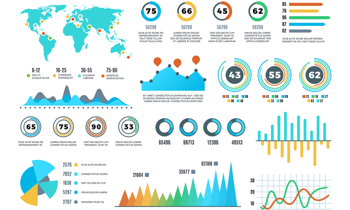
Have you heard of data visualization? Even if you don’t know the term, you’ve probably seen some examples.
Data visualization refers to graphical images that represent and explain data trends or other numerical information, such as charts, maps, scatter plots, or graphs.
You can use data visualization in articles or on web pages to make numbers and data easily digestible to the reader. Especially when you are trying to distill down complex topics to convert more readers, data can add value and help you make your case.
The Benefits of Data Visualization
Visuals are a powerful addition to your articles and presentations.
Our brains process images at a rapid pace, according to an MIT study. Including visuals in your article not only breaks up the text and gives your reader something else to look at, but also may help them process the information more quickly.
Think about it: we’ve been communicating visually from the cave painting days. Data visualization just takes image communication to the next level, integrating stats and data into compelling visuals that your brain can absorb faster than just scanning numbers.
Plus, it’s more than just laying out the numbers. Data visualization is about presenting data in a very specific way to back up your claims or illustrate your point. It’s more than just a table of statistics the reader has to work through to figure out for themselves.
Numbers can often be the “proof” you need to convince your reader to take the next step or to make a purchase, but many people don’t want to take the time to read through all the data.
According to the Nielsen Norman Group, people don’t read word-for-word online, going back to the internet’s earliest days. Instead, they scan, looking for stand-out headlines and images that grab them. Data visualization gives you that opportunity to capture their interest and get important stats in front of their eyes.
Examples of Data Visualization
Are you inspired to start creating data visualization images for your content, or are you still needing some examples? Here are a few ideas to get you thinking.
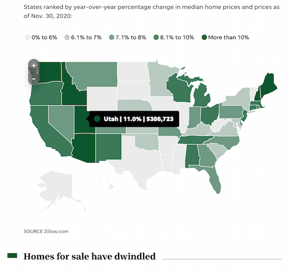
1. USA Today Housing Bubble Graphic
Using an interactive map, USA Today created this graphic to help readers understand the data behind current housing sales trends. The simple color palette makes it visually appealing, and the ability to scroll over each state to learn more means readers may spend more time on the page, interacting with the data.
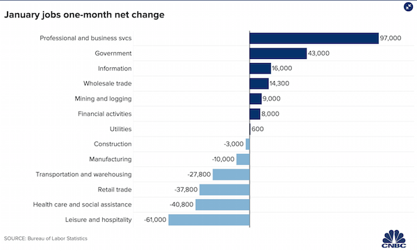
2. CNBC Job Change Graph
This visual from CNBC is an example of using a bar graph in a visually compelling way. At a quick glance, you can see what’s growing and decreasing. As you look closer, you can check out more detail about the numbers and specifics.
3. NY Times Nutrition Scatter Plot
Scatter plots can get complex, which is why this graphic from the NY Times uses images to help make the point. It also explains the XY axes, so readers understand what they’re looking at.
Types of Data Visualization
When it comes to creating unique images, the only limit is your imagination, but here are a few common types to get you started.
Bar Graphs
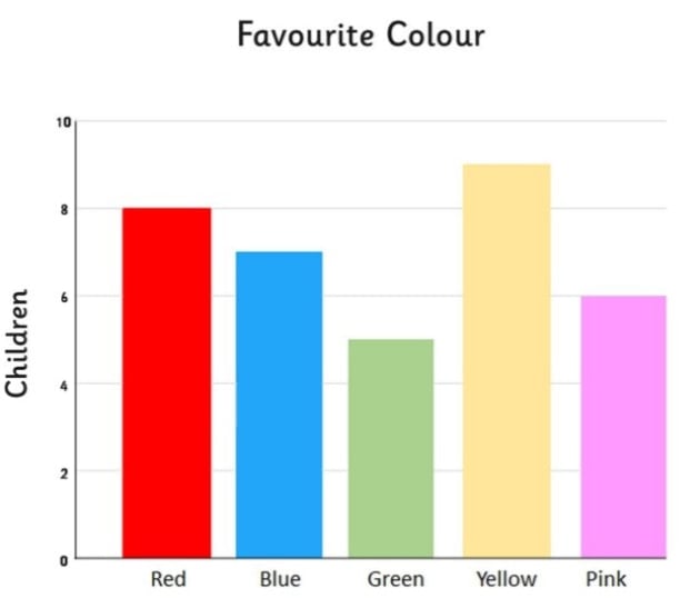
Bar graphs are a simple option. Think back to your school days and science projects. Bar graphs can be vertical or horizontal, with each bar representing the values of each category.
Bar graphs can represent any set of numbers you need to compare side-by-side, and you can use colors to reflect different categories. For example, you could compare salaries for different jobs, prices for different products, or populations of different groups.
Pie Charts
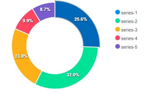
Pie charts consist of circles representing 100% of something, broken into “slices” of ratios or percentages.
They are a great way to illustrate how various categories compare to their larger context. For instance, you can show how many people of a certain group have different behaviors, habits, or preferences.
Tables
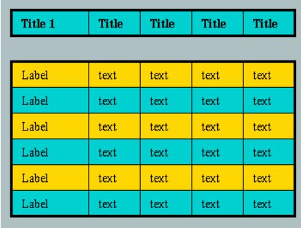
While not always the most visually compelling, tables can allow you to provide multiple data points or categories to help people understand the relationships among items.
On a table, you can lay out in rows the main categories you’re comparing. Along each column, you can include as many different topics as you need to.
Tables are simple and useful but can easily get cluttered. Make sure to highlight the sections that need your attention and use colors to make things stand out. Keep everything lined up and clear to make it easily scannable for your readers.
Infographics
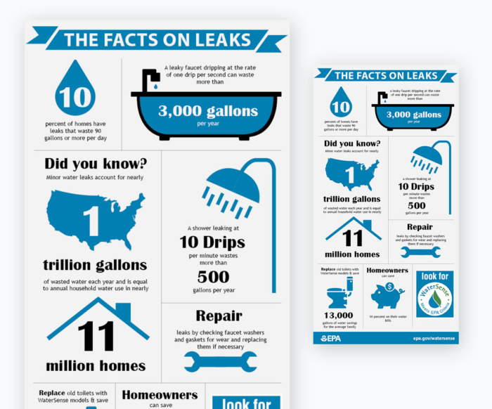
A power horse of online images, infographics can mean almost anything. However, an infographic typically acts as a curated collection of charts, graphs, icons, and short text to share high-level information about a topic or tell a narrative.
They are usually vertically designed, with strong headlines and numbers. Its power comes in combining various elements to tell a story. Infographics are great for an overview, such as a brief history behind a topic or a quick lesson.
GIFs
What’s more visual than a GIF? Functioning as a quick video, a GIF can allow you to show growth, movement, regression, or progress. GIFs often involve an animated graph or chart that shows demographics or change over time.

Maps
When the information you present is demographically or locally focused, maps can help tell that story visually. You can connect readers with information relating to specific areas or groups of people in those locations.
Color-coding different areas of your maps can give your readers a quick visual of exactly which areas relate to which topics in your content. For instance, you can shade areas red or blue depending on how that region voted on a particular topic or election.
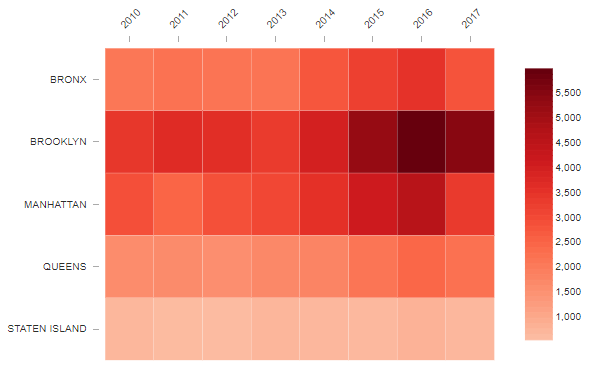
Heat Maps
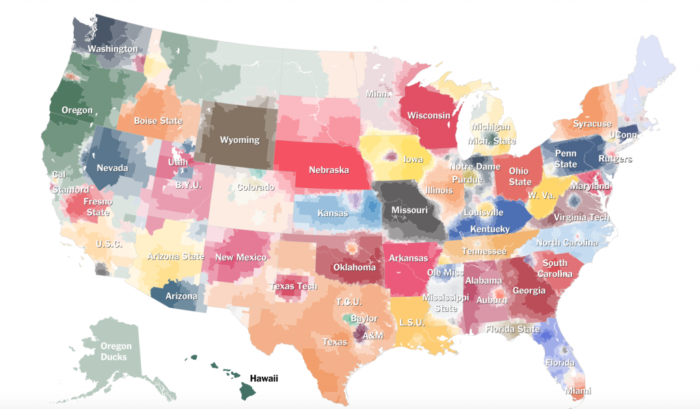
A heat map can show areas of concentration or intensity. You can use this for actual temperatures, such as climate or record temperatures in certain areas, or you could use it for proverbial heat, showing intensity or even popularity.
Sometimes heat maps illustrate population density, for instance, or the behavior of users on a website, such as how often they interact with a certain area.
Scatter Plots
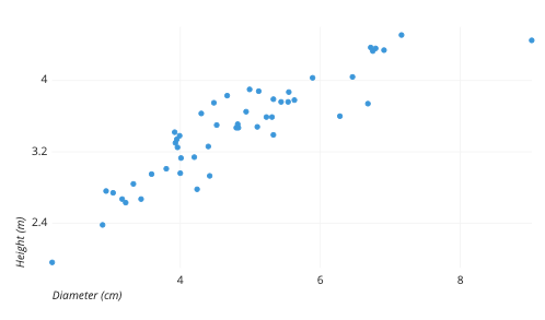
A scatter plot is a type of graph that shows the correlation or relationship between two topics on a horizontal and vertical axis, with dots scattered throughout to represent examples of that relationship.
You can draw a line through the area where the dots are concentrated to see trends. Your reader can see that as one factor changes, such as increases or heats up, the other factor tends to respond in some way.
Pair Up Simple Data Visualization Types
The above are just a few of the simple elements you can use to illustrate your data. The options are almost innumerable. Just about any kind of chart, graph, or map can be employed.
However, some of the best data visualizations integrate multiple types or pair up more than one element. For instance, you can use a series of pie charts to show how trends have changed over time.
Sometimes, matching up multiple elements can illustrate your point more fully or allow you to describe various points of your narrative better. You could even use a chart within a chart or lay them out in an infographic style to tell a story.
Make Data Visualizations Interactive
To make your data visualization work hard for you, you may want to consider interactive options.
Interactivity allows readers to scroll over or click on various parts of your charts or graphics to learn more about each section. Maybe each bar on your graph or each area on your map has more specific information that your viewers can read.
This not only provides more powerful data points to your image, but it also allows it to be a more relevant and customizable experience for more users.
Data Visualization Tools
You can create data visualization images for your content from scratch using design software or an online option like Canva. However, data visualization tools can give you a leg up by allowing you to create truly stand-out projects.
These tools can take the guesswork out of the process and let you focus on plugging in the data and cranking out designs that reflect your brand and convey your message.
The great thing about these tools is that they are made for the casual creator. You don’t need to be a developer or coder to get into making great charts or graphs. Here are a few of the plug-and-play options that can get your idea off the ground.
Flourish
Flourish advertises an easy option for creating and sharing data visualization. You can upload spreadsheets directly to the platform or create your images from scratch. It has a number of animated or interactive templates, which you can update with your brand graphics and elements.
Flourish has a free option that allows you to explore and create public data visualization. If you want to interact with your team or create private projects, it offers a few levels of paid options.
Datawrapper
Datawrapper promises to be easy to use, with no coding experience required. It provides several intuitive options, with tools such as a color-blind check that remind you of colors that are color-blind friendly.
With a variety of defaults in its templates, Datawrapper brings the details of each data visualization that newbies may not have thought through.
Infogram
This tool allows you to create charts and graphs that have the animation and customization you need to wow your audience. You can also use Infogram’s drag-and-drop feature to drag the images around and combine elements into a single, highly-effective visual.
Tracking the Success of Your Data Visualization Elements
The time and effort it takes to create data visualization and work it into your content can pay off if it helps drive people to your goals, like increasing readerships or leads. However, you’ll only know if they’re successful if you track the metrics.
Consider the Big Picture
As you start incorporating data visualization into your content, one of the easiest ways to track their success is to see how well your content is doing. The most basic questions to ask are: is the content with data visualization more popular? Do those pieces get more readers and more shares?
Dive Into the Data
One way to get a little geeky with your data is to set up a heat map tool, such as Hotjar. This can give you more data about how people behave on your page, such as how and where they scroll or click. This is especially useful for a landing page where you’re trying to convert people to sales.
Help Them Act
The only way to know if your data visualization is actually converting is to give readers a way to be converted. Once they have been convinced by the data you are sharing, what do you want them to do next? Make sure you keep clear CTAs near the data visualization. Clicks or email sign-ups can help you track the effectiveness of that image.
Conclusion
Data visualization can help you drive readership and more leads by engaging with them from the start. People come back to your online hub when they find quality content there. They’re also more likely to share your content with others when they find it interesting and engaging.
Data visualization can help you take complex or dry concepts and make them more compelling, helping drive home your point and increase sales along the way.
If it feels daunting to create and manage your data visualization elements, we are here to help out. We also offer services like SEO, content marketing, and paid media.
What kind of data visualization are you going to use in your content?
The post How to Use Data Visualization in Your Content to Increase Readers and Leads appeared first on Neil Patel.
About us and this blog
We are a digital marketing company with a focus on helping our customers achieve great results across several key areas.
Request a free quote
We offer professional SEO services that help websites increase their organic search score drastically in order to compete for the highest rankings even when it comes to highly competitive keywords.
Subscribe to our newsletter!
More from our blog
See all postsRecent Posts
- Web Hosting September 26, 2023
- Affiliate Management September 26, 2023
- Online Presence Analysis September 26, 2023

