Disclosure: This content is reader-supported, which means if you click on some of our links that we may earn a commission.
The right image convinces a conference room instantly.
Sell that new client, get your boss’s approval, and rally the team behind you. Data visualization tools turn a whole mess of numbers into a crisp image that says it all.
With the right product, you can take command of overwhelming amounts of data to tell a clear and compelling story. Leave your audience with a visual that resonates long after your presentation ends.
In this post, I’ll give a complete overview of the best data visualization tools, and what to look for as you make your decision.
#1 – Tableau Review — The Best for Enterprise
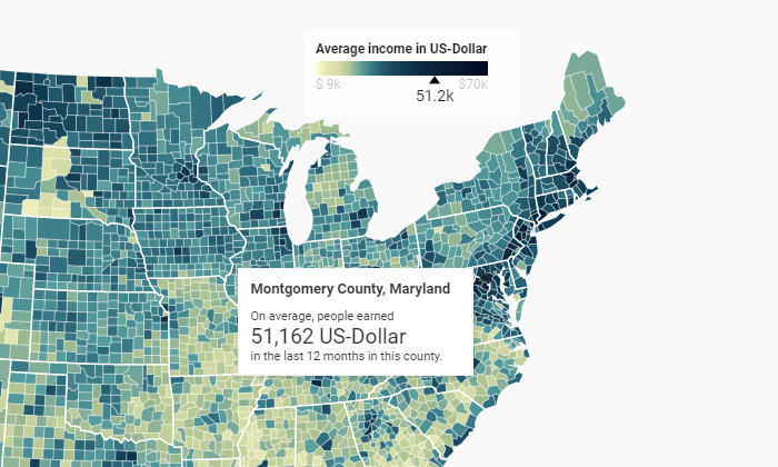
Tableau is a best-in-breed business intelligence (BI) software with phenomenal data visualization capabilities. It’s not the cheapest option on the market, but you get both an intuitive UI and the ability to drill down into virtually any data source.
In other words, you don’t have to make the typical sacrifices. Tableau is ultra-powerful in terms of supported visualizations, but it’s really user-friendly once you get it set up.
Many companies elect to use Tableau in order to encourage a data-driven, transparent, collaborative culture. It’s also one of the most secure products on the market, with enterprise-grade governance tools and the option for on-premises deployment.
For the most part, Tableau can do everything that any other data visualization tool can, but better. Some of the standout capabilities include:
- Combine different data sources without writing code
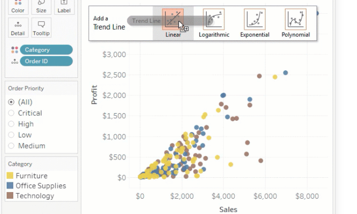
- Drag-and-drop statistical analysis, forecasts, and trendlines
- Optimize dashboards for all screen sizes
- Natural language queries of any published data source
- AI-powered data analysis
- Publish data sources as encrypted extracts on Tableau Server
- Robust data management tools
- Support and solutions from an active community of over 1 million users
Team pricing for Tableau is role-based, which lets large organizations economize their subscription. The roles are:
- Creator: $70 user/month
- Explorer: $35 user/month, 5 user minimum ($42 if fully hosted by Tableau)
- Viewer: $12 user/month, 100 user minimum
Creators have full author/edit privileges, and can connect new data sources and flows. Explorers can work with most existing assets and create their own visualizations. Viewers can interact with data and collaborate with colleagues, though they cannot author or prepare data.
Tableau Public is a free forever version of the product and the company offers a free 14-day trial that lets you test drive some of the premium features.
#2 – Infogram Review — The Best for Collaboration
Infogram is an intuitive data visualization tool that delivers stunning reports, slides, dashboards and social media visuals.
First-time users are going to love the UI. Basically all of the visualization building can be accomplished via drag-and-drop.
This isn’t one of those tools you need to hire a software developer to babysit. Anyone can start using Infogram immediately, turning raw statistics into beautiful infographics and captivating visuals.
Infogram makes it easy for teams to share and produce consistent work with customizable branded templates, role-based permissions, and file versioning.
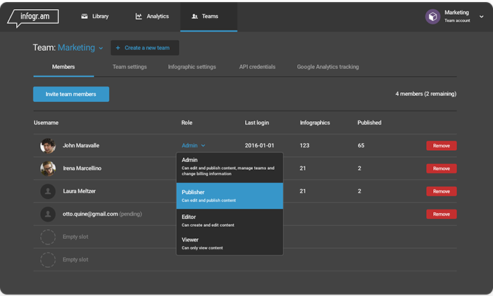
You can see who’s editing your projects in real-time and you can add comment threads directly to an image within the infographic.
Teams can get up and running with Infogram quickly, taking advantage of its incredibly deep design capabilities::
- 1 million stock images and icons, as well as animations, GIFs, and video
- More than 35 interactive charts and over 550 interactive maps
- Preset and customizable branded design themes
- Data integration with Google Analytics, Amazon Redshift, OneDrive, MySQL, Oracle, and more
- JSON feed to import live data
- WordPress plugin
The streamlined features don’t stop there. Tasks like embedding projects, for example, involve no more than copy/pasting embed codes into your CMS.
Infogram can be extremely beneficial for companies of any size. In addition to a free forever version, Infogram offers several pricing tiers:
- Pro: $19/month for an individual
- Business: $67/month for an individual
- Team: $149/month for 3 users
- Enterprise: contact sales
With Team and Enterprise subscriptions, you get the ability to invite members, set flexible permissions, share projects, and collaborate in real-time.
Connect your data, get the input you need, and start publishing great looking content before the end of the week.
#3 – Plecto Review — The Best for Sales Teams
Plecto is a great tool for promoting a data-driven team culture. The idea is to involve everyone in the constant flow of data by making all relevant KPIs available in a real-time, highly-visible dashboard.
Okay, plenty of other tools can do that. Gamification is where Plecto really separates itself from the crowd.
Gamification? Yes, it’s a word, and a hot one these days. With Plecto, it’s super simple to create contests using your KPIs as benchmarks. This could be sales closed, employees hired, lists built—whatever metric you need to drive, use Plecto to enable the spirit of competition.
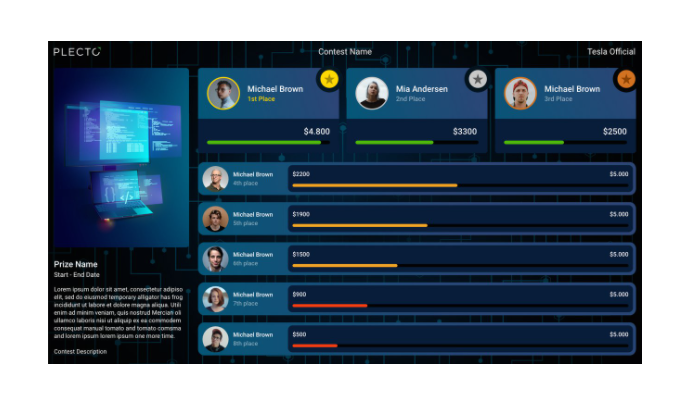
Plecto is built for this. It’s easy to set goals and achievements that are directly tied to the numbers you care about. Increase transparency and motivation at the same time.
The platform’s capabilities work exceptionally well for sales teams, yet other departments across the organization can benefit from the unique mix of features and functionality, which include:
- Unlimited dashboards and data sources
- Custom KPIs
- Display multiple dashboards on the same screen
- Integrations with Microsoft SQL, Oracle SQL, PostgreSQL, and MySQL
- Notifications based on thresholds and other milestones
- One-click integration with more than 60 leading cloud services
- Create and track individual performance agreements in private employee-manager dashboards
There are three plan options for Plecto:
- Medium: $100/month for 5 licenses, $20/month per additional license
- Large: $350/month for 10 licenses, $20/month per additional license
- Enterprise: Contact sales, minimum 100 licenses
Some of the important data visualization tools (like SQL integration) are not included with the Medium plan. You only need to buy licenses for users who send their data to Plecto (view-only users are free).
#4 – Datawrapper Review — The Best DIY Data Visualization Tool
Datawrapper has a simple chart tool feel, yet it’s got the ability to deliver interactive and responsive charts, maps, and tables.
It’s not designed for BI so much as mass producing next-level data visualizations to capture attention on feeds and pages.
Lots of companies, like The New York Times, for example make use of Datawrapper every day to improve their content. Using striking visuals, the Times can convey complex ideas to consumers about voting data, consumer preferences, and so on.
Datawrapper has a clean, intuitive interface that makes it easy to engage with the cloud-based product’s full range of functions, which include:
- Copy data from Excel, Sheets, or the web into Datawrapper
- Create live-updating charts by uploading CSV/XLS files or linking to a URL
- Embed different types of interactive and responsive charts, maps, and tables
- Export as PNG, PDF, or SVG
- Colorblind check for all images
- Live-updating graphics for maps
- Collaborative tools and shared team folders
- On-premise creation to comply with regulatory requirements
You have to purchase premium plans to create custom charts and white-label projects. Custom, the first tier above free, starts at $599/month and really allows companies to reach their audience with on-brand, original visuals.
Datawrapper’s free version is excellent for internal or team use, but less attractive for public-facing visualizations.
#5 – Highcharts Review — The Best for Interactive Visualizations
Highcharts is a wonderful tool aimed at helping developers add interactive charts to web and mobile projects. It’s a clean, SVG-based, multi-platform, JavaScript charting library.
Upload multiple types of data and use official wrappers to work in:
- Microsoft .Net
- Python
- PHP
- R
- iOS & Android
This product requires some technical skills to use effectively, but the tradeoff is that it’s relatively inexpensive and works with any database or stack.
And the results are phenomenal.
Highcharts is extensible, scalable, and meant to work anywhere on every device. Some of the key features include:
- Multiple map types (heatmap, mapline, tilemap, etc)
- Dedicated Highcharts Gannt product
- Export JPG, PDF, PNG, or SVG
- Add tooltip text information when users hover over labeled data points
- Pure JavaScript requires no client-side plugins
- Intuitive configuration and chart editing
- Mobile and touch-optimized for truly interactive user experience
- Download, inspect, and edit Highcharts source code.
For personal, non-commercial, or non-profit organizations, all of Highcharts’ products are available for free. This includes Highchart Stock, Gantt, Maps, Editor, and Mobile.
They also have deals for startups and ways for other businesses to customize the various Highcharts products to their needs. Contact sales to start putting together a pricing plan.
What I Looked at to Find the the Best Data Visualization Tools
I get it. There are a million tools to help you visualize your data.
Then, when you start digging, it’s like, “Wait, do I have to know several programming languages to use this really cool product?”
Slow down. Don’t worry. You’re not going to have to go back to school to get amazing data visualizations.
Some of the high-end tools will require a little IT know-how to get off the ground, but those are really aimed at companies who can factor that into their budgets.
If that’s not what you’re looking for, no worries. There are really great data visualization tools a non-specialist can have up and running before lunch.
The key is knowing what you want your data visualization tool to do.
By understanding your local requirements, you can whittle down your options quickly by going through each of the major elements of data visualization products.
Visualization Capabilities
Are you looking for a nice tool that creates sleek reports, or a platform that lets you publish interactive dashboards?
Every vendor showcases data visualization examples on their site. Check these over and really reflect on your gut reaction.
If you are in search of the “wow” factor, don’t settle until you find something that will give your presentations that aesthetic edge.
Connectivity
This is perhaps the biggest make-it-or-break-it factor on the list: What data types and sources are supported by the data visualization tool?
No data visualization tool is good enough to justify a massive migration. You need to find something that connects with your data, wherever it lives.
Ideally, connecting data is an easy, secure, and highly-visible process.
Look for products that clearly explain how to manage and connect data sources. Official partnerships with the database products you use is a big plus.
Cruise a few reviews to see if people are finding that the connectivity is as good as advertised. Also, be sure to walk your sales team through your desired deployment to make sure it’s going to work as planned.
Skill Requirements
Not so long ago, complex data visualization required familiarity with structured query language (SQL), Python, or another language.
Today, great data visualization products like Tableau allow users to search vast databases using natural language. They provide drag-and-drop functionality that lets non-specialists drill down into the most complex questions.
That said, if you have complex data flows coming into real-time dashboards, it’s a good idea to have someone in-house who can ensure that everything is running smoothly.
Mobile Compatibility
Look for something that will appeal to your clients and customers, however they browse.
Does your data visualization tool support touch and multi-touch?
Good interactive visualizations take a lot of effort, and the last thing you want is for users on iOS or Android to be barred from the experience because of incompatibility.
Quality data visualization software delivers a final project that looks good on desktop, tablet, or smartphone. You can’t really budge on this unless you are committed to developing visual content for internal use.
Another thing to think about is collaboration. Will your remote and on-the-go employees be able to stay current with their team projects?
Summary
The best data visualization tool for you is going to depend on what you are trying to get done, and the type of business data you want to visualize. Let’s recap my top picks:
- Tableau – Best for enterprise
- Infogram – Best for collaboration
- Plecto – Best for sales teams
- Datawrapper – Best DIY visualization tool
- Highcharts – Best for interactive visualizations
Tableau is the best tool for enterprise because it gives teams an edge in every aspect of data visualization.
It’s a considerable investment, though, and not every company is looking for a full-bore business intelligence solution.
If what you need is a data visualization tool to build and share memorable images, Infogram will help your teams take their game to the next level with zero graphic design or programming skills.
For companies that want to embed interactive visualizations in their online content, look no further than Datawrapper. Highcharts is another great option for embedding interactive content into your sites, though it’s not as easy for non-specialists as Datawrapper.
Coming back to Tableau for a second—yes, it’s heavy, but you can try the free version today without having to navigate a multi-step enterprise sign-up process. There aren’t any hoops to jump through, just the chance to take your data visualizations to the next level.
About us and this blog
We are a digital marketing company with a focus on helping our customers achieve great results across several key areas.
Request a free quote
We offer professional SEO services that help websites increase their organic search score drastically in order to compete for the highest rankings even when it comes to highly competitive keywords.
Subscribe to our newsletter!
More from our blog
See all postsRecent Posts
- Web Hosting September 26, 2023
- Affiliate Management September 26, 2023
- Online Presence Analysis September 26, 2023