In the past few years, there’s been a debate about the importance of your website’s homepage.
With the variety of ways people navigate the web, some argue that website homepages are seldom the first thing people see anymore. From social media ads that link directly to your landing page or links that go directly to blog content, it’s easy for people to totally circumvent your homepage entirely when they visit your website.
But despite all of that, we would argue that your homepage is still extremely important.
It’s possible that your homepage isn’t the most profitable part of your website. But, when correctly designed, your homepage is definitely the most powerful part of your site.
It’s true.
It is a lot easier now to get people directly to your sales or landing pages. But if we’ve learned anything from the Customer Value Journey, it’s that jumping right to the sale is never the best way to actually get (and keep) a customer.
Think about it. How often do you immediately buy something once you land on a sales or product page? Odds are, you do a little research and look around the website before breaking out your credit card. And this research starts on that company’s homepage.
That’s why your homepage is so important—it provides the basis for your business’s trust factor.
Your homepage should be a multitool in your marketing efforts. It’s not like a sales page or a contact page, where it only has one purpose. For your homepage to be truly effective, it has to do at least these 3 things well:
- Clarify the benefit of your product (and what it is)
- Establish trust
- Point the way
Your homepage probably won’t close a sale, but it can absolutely lose a sale. If someone finds their way to your homepage and can’t understand what you do or don’t like what they see, there’s way less of a chance you’ll get that customer.
Your homepage needs to be clear, concise, and professional. And lucky for you, there’s a few things that everyone can do to optimize their homepage.
Use these 4 tips to turn your homepage from a simple webpage to a powerful business tool.
1. Great Design Won’t Save Bad Copy
When you’re first creating your website homepage, it’s really tempting to get completely focused on how it looks. It’s understandable—a good-looking homepage with a great design not only helps people navigate your site, but it makes your company look extremely professional.
And while both of those things are true, your homepage copy is definitely the thing you should really be investing time into.
To understand this, you need to remember what the #1 point of your homepage is: to clarify the benefit of your product.
No matter how hard you try, design can’t do that as well as copy.
Your homepage may be the driving force of your website, so of course you want it to look good. But you have to remember that looks don’t matter if the customer can’t figure out why they should buy your product in your first place.
To do this, you need to figure out how to sum up your product in an enticing way. What’s the copy you need on your website that will make people read and say, “I have to buy that!”
A little tip from Donald Miller, Founder of StoryBrand, is to not just simply state what your business or product does, but rather lay out the problem it solves.
A great example of clear, concise homepage copy is TurboTax.

In 3 short sentences, TurboTax’s copy lets you know exactly who they are and the problem they solve: “real tax experts” ready to help you as much or as little as you’d like.
This copy clarifies the benefit of using their service, and that doesn’t even include the customer testimonials and satisfaction guarantees further down the page that help establish trust.
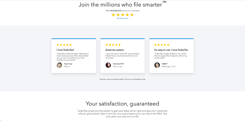
This website also has a great call to action, but we’ll talk more about that later on…
If you can make your homepage copy informative, clear, and engaging, it will go a long way in helping you make those sales that might slip through your homepage cracks.
The only catch is, you need to be able to do that quickly…
2. Use the 7-Second Test
With your design and copy in hand, you should be able to make a good draft of your new homepage. Once you do, it’s time to do the 7-second test.
The process is simple. Grab a neutral observer, someone who’s unfamiliar with your business, and have them look at your homepage. For your homepage to pass the test, they should be able to tell you 3 things in 7 seconds or less:
- What your product is and what problem it solves
- Why they should care
- What you want them to do next
These are the 3 things that, from looking at your homepage, you want your customer to immediately know and understand about your business.
You have a very limited time to catch your customer’s attention and tell them about your business. The internet is a big place, and failing to make an immediate good impression on your visitors is going to make them go somewhere else.
Studies as recently as 2020 show that people, on average, spend just under 15 seconds on a website. To be truly effective, it’s best to aim to get their attention (and your point across) in half that time.
Because if you can accomplish that in 7 seconds, then they can spend the remaining 7 judging if your site appears trustworthy. If you get them to stay past 15 seconds, then you’ll know you have a pretty good chance at getting a new customer.
3. Clarify Your Audience
When you’re designing your homepage and writing your copy, it’s important to keep your ideal customer in mind.
Anyone can visit your website, which is why most companies look to appeal to as wide of an audience as possible. If you can make a good impression on a wide range of people, the more likely it is you’ll make a wide range of sales. Right?
Wrong.
You shouldn’t be trying to sell to everyone. You want to sell to your target audience, your customer avatar. Anyone else who buys is just the cherry on top.
So, how do you do this? And how does this fit on your homepage?
For starters, you should know exactly who your ideal customer is. You should know their hopes, dreams, fears, pain points, and interests. Once you have that comprehensive understanding, then you’ll know exactly how to reach them.
The broader purpose of clarifying your audience is so you can use that knowledge when crafting your messaging.
Let’s take a look at a couple of examples:

Wicked Reports, a service that helps businesses optimize their ad spend and maximize ROI, has a really good homepage. Because they know exactly who they’re selling to: ecommerce marketers.
If you’re an ecommerce marketer looking for some help with lead generation and acquisition, you’ll immediately know that you’ve found the right place. The copy tells you instantly the problem that they solve and the solutions that they offer. All above the fold of their homepage.
Last but not least, they have a subtle but effective hero shot: a short video of someone working on their keyboard. There’s no question who Wicked Reports is targeting, and their doing a great job at hitting them with effective messaging.
Another example is popular fitness company Peloton.

Peloton’s copy doesn’t lay out exactly what they do, but it does promise that buying their bike will allow you to “get a head start on your goals.” And if you have any question about what it does, its sliding deck of hero shots answers all of those question by showing in-shape people using their products to exercise.
Peloton is targeting people that want to get or stay in shape. Their visuals do a lot of the heavy lifting to paint the picture of the after-state that their potential customers will find themselves in if they use their products.
Peloton primarily uses their copy to focus on what their customers want to do: get a head start on their fitness goals.
Understanding your customer avatar is key when designing your homepage. If you know who you’re targeting, then you can create an effective page that speaks to them.
4. Choose a Primary Call to Action
Last but not least, make sure you have a really good CTA on your website.
Your CTA is the most important part of your homepage because it accomplishes the main goal: pointing the way.
And yes. We mean just a good CTA. Just one.
The reason why is because of the fear of conflicting messaging. If you have a nice-looking homepage that communicates exactly why people should buy your product or engage with your business, the last thing you want to do is confuse them about what to do next.
Here are some good CTAs that you can use on your website:
- Lead magnet opt-In
- Register/join
- Take a quiz or assessment
- Start a demo/trial
You’ll notice that “purchase now” is not included on this list. That’s because, for your homepage, it’s really not an ideal CTA for most businesses.
Again, the point of your homepage isn’t to make a sale. It’s to inform and establish trust with your audience. So, ideally, you want to offer something or tell them do something that’s free.
Let’s look at our examples above.
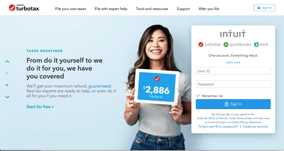
For TurboTax, their CTA is “start for free.” They key word there that will make people click is “free.”
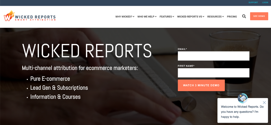
Wicked Reports, on the other hand, has an opt in. By giving them your name and email, you can get a 3-minute demo video about what you can actually accomplish with their product. This is a simpler version of starting a demo or trial, and it’s also completely free of cost to the customer.
Wicked Reports can then use your contact information to retarget you later if you don’t immediately buy.
Last but not least, we have Peloton.
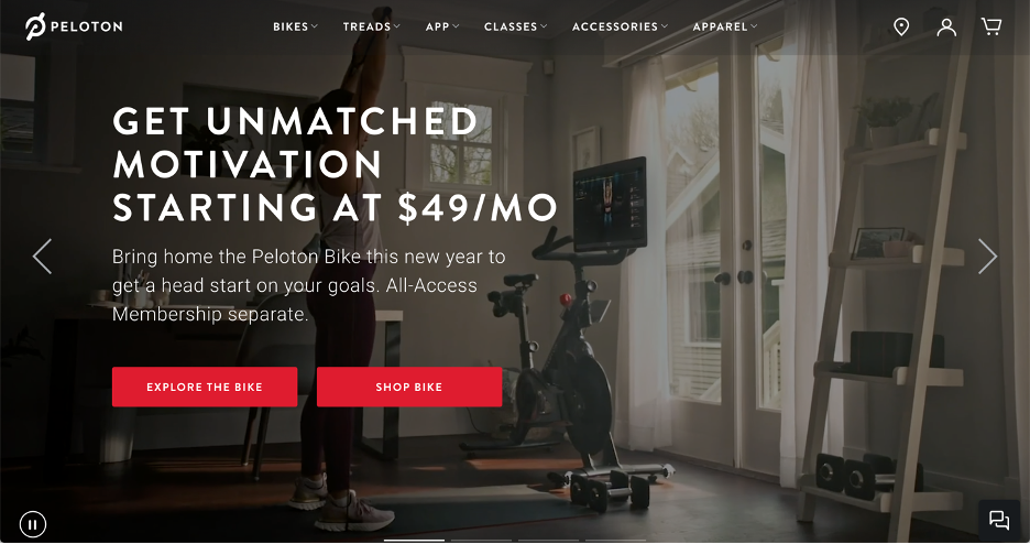
You’ll notice that Peloton is the exception to this rule. Not only do they have two CTAs, but one of them is to shop for bikes. The other one, their secondary CTA, is simply prompting people to explore their catalog of products and compare pricing.
Why does Peloton do this?
Peloton’s social credibility has already established enough trust in their business that when people land on their homepage, chances are they’re looking at pricing. They also have different CTAs that appear with different hero shots.
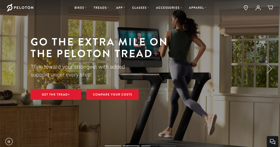
Most potential customers know what Peloton is—the company doesn’t need to teach people about their product as much. The actual biggest obstacle for their business is the cost of their product. That’s why their CTAs have people immediately diving in and learning about their pricing.
This strategy works for them, but it definitely won’t work for everyone.
The best practice is to use your CTAs to get people’s information and offer them something for free. If you do that, you’ll have a great shot (at least eventually) at turning them into a paying customer.
Be Flexible
These 4 tips will help anyone create an amazing homepage for their website, but there is one more thing that you should know.
Your homepage shouldn’t stay the same.
Depending on where your business is at in its lifecycle, you may need something totally different out of your homepage than you did 3 months ago. Whether it’s laying out basic information about your product like Wicked Reports or (one day) encouraging people to buy like Peloton, your homepage can do it all. You just need to know when it’s time to make those changes.
That’s why homepages are so powerful—they can do whatever your business needs at that time. So, as your business needs change, your homepage should change too.
Whether you’re creating a homepage for the first time or updating your homepage for the 100th time, these tips will always help you optimize it to get and keep more customers. Then all you’ll have to do is sit back and watch your website make more sales and generate more leads.
The post 4 Tips for Crafting Your Perfect Website Homepage appeared first on DigitalMarketer.
About us and this blog
We are a digital marketing company with a focus on helping our customers achieve great results across several key areas.
Request a free quote
We offer professional SEO services that help websites increase their organic search score drastically in order to compete for the highest rankings even when it comes to highly competitive keywords.
Subscribe to our newsletter!
More from our blog
See all postsRecent Posts
- Web Hosting September 26, 2023
- Affiliate Management September 26, 2023
- Online Presence Analysis September 26, 2023

