Landing pages are a critical component of any digital marketing strategy. They are responsible for converting your visitors into consumers. Without a strategically optimized landing page, your potential customers are likely turn to your competitors for similar products/services. Fortunately, at DigitalMarketer, we’ve cracked the code for creating the most successful landing pages with the best conversions.
In our YouTube series, Marketing Mastery with DigitalMarketer, I talk about the 4 landing page elements that will make or break your page.
So, check out the video, and keep scrolling if you want to read more!
4 Landing Page Elements That Will Make or Break Your Page
Number 1: The Offer
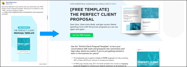
The offer is without a doubt the most critical part of any landing page. It doesn’t matter how pretty (or ugly) the page is, if you have a crappy offer… well you’re going to have a bad time.
The offer breaks down into 4 critical points:
- Clarity
- Scent
- Relevance
- Visualization
Even if you have an amazing offer, if you stink at articulating it the page won’t convert. So, ask yourself whether what you’re showing is desirable and you’re CLEARLY articulating WHAT IT IS and WHAT’S IN IT FOR YOUR PROSPECT.
Scent or CONSISTENCY is the next offer game changer. Make sure that the page offer (and design) is consistent with the referring source. You can do this by matching landing page copy to ad copy, using similar visuals from the ad to the landing page, and keeping things consistent from start to finish.
Relevance is next and this one is all about TARGETING. If your offer isn’t relevant to your audience, then you just paid premium for a click that isn’t going to do a darn thing on your page. Make sure your targeting is on point, you’re consistent from the source, and you’re crystal clear and you’ll see conversions jump.
Finally, visualization. You can’t just rely on text to sell. You need to visualize the product, the features, and most importantly the benefits IN ADDITION TO using clear and concise persuasive copy.
Number 2: The Ask (or your Form & CTA)
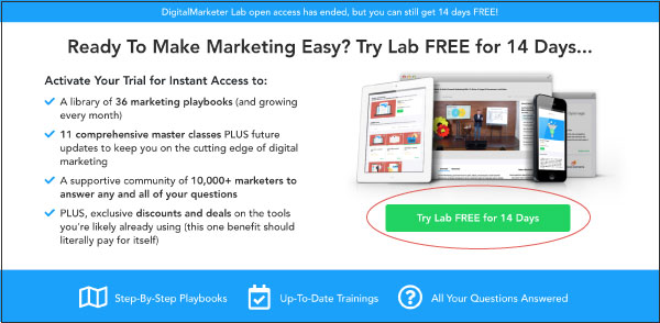
Your ask needs to be evident. Whenever someone hits a landing page, they need to know what, why, and what to do next.
This is the “What to do next” step…
There are a few things you HAVE to do to make sure you get the most out of your form and CTA.
First: If you’re using a lead gen form, make sure the length is consistent with the VALUE of your offer. If it’s an email newsletter, ask for an email (and maybe name). If it’s a demo form, ask for more!
Second: Make sure the form or CTA is noticeable, visible, and REITERATED on longer pages.
Number 3: Trust
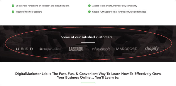
People don’t like giving up information, personal OR billing, to people they don’t trust. Unless you’re a well-known brand, you don’t have brand authority on your side so you need to build up some rapport.
An easy way to do this is have a professionally designed page. Now this doesn’t mean beautiful or aesthetically pleasing, but something that doesn’t look like it was made in a scammer’s basement.
Depending on the level of your ask, you’ll want to have RELEVANT trust icons. So, if you’re asking for personal information include a privacy policy. If you’re asking for billing information, share guarantees or utilize security seals.
One of the best ways to get people to trust you (and your page) is to show that people have used your product/or service and have LOVED it. The best way to do this is with authentic customer testimonials, ratings, or reviews (for you in the B2C space).
Don’t have stellar testimonials? Well if you’re in the B2B world, you could share logos of your clients (if they’re OK with it).
Number 4: Visual Hierarchy
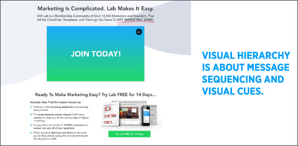
I briefly talked about design in the trust section and about some design elements in the form/CTA section.
Visual hierarchy is different because it’s really about two things:
- Message Sequencings
- Visual Cues
Elements on a page are meant to articulate a message—copy tells the what, images can show the what and the why, etc.…
However, you can’t just plop them on a page with no plan for how you want these messages to be consumed! Visual hierarchy takes care of all of that.
In general, you want to address the what, the why, and the what’s next (or the ask) using several different types of form elements throughout the page. Once you know HOW you want to articulate you need to choose when.
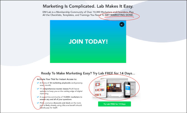
You can use visual cues to highlight key pieces of information, like putting the most important content in the lightest section or using arrows to point something out.
From there, you just need to make sure the page fits a singular theme and MOST IMPORTANTLY: Renders well on all devices.
If you are only building for mobile or only building for desktop, you’re going to alienate your visitors. Don’t just rely on responsive page themes either, they solve a rendering problem but do not solve the sequencing one (out of the box).
So, to recap, if you want a high converting landing page, you’re going to want to optimize:
- Your Offer (what it is and how you articulate it)
- Your Ask
- Your Trust Factors
- Your Sequencing & Page Design
If you want to dive deeper, I have a free gift for you to help score your landing page that is available to all DigitalMarketer Insiders. If you’re interested, click HERE.
And head over to our YouTube channel every week for more Marketing Mastery tips.
The post 4 Landing Page Elements That Will Make or Break Your Page appeared first on DigitalMarketer.
About us and this blog
We are a digital marketing company with a focus on helping our customers achieve great results across several key areas.
Request a free quote
We offer professional SEO services that help websites increase their organic search score drastically in order to compete for the highest rankings even when it comes to highly competitive keywords.
Subscribe to our newsletter!
More from our blog
See all postsRecent Posts
- Web Hosting September 26, 2023
- Affiliate Management September 26, 2023
- Online Presence Analysis September 26, 2023


